Peakiq Blog
React Native hitSlop: Make Tiny Taps Easy
Discover React Native's hitSlop prop to enlarge button touch targets without altering layout. Perfect for small icons, improving mobile UX and accessibility.
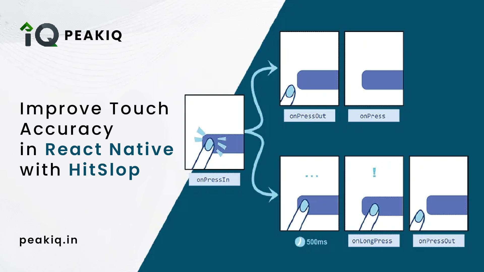
React Native hitSlop Explained — Improve Touch Area for Small Buttons
Small buttons are a UX problem. Users miss them. They tap again. They get frustrated.
hitSlop solves this without touching your layout. Published on peakiq.in.
What is hitSlop?
hitSlop is a prop available on touchable components like Pressable, TouchableOpacity, and TouchableHighlight. It expands the tappable area of a component beyond its visual bounds — invisibly.
No extra padding. No layout shifts. Just a larger touch target.
How It Works
You can pass hitSlop in two ways:
As a number — expands the touch area equally on all four sides:
hitSlop={10}As an object — expands each side independently:
hitSlop={{ top: 10, right: 16, bottom: 10, left: 16 }}Think of it as invisible padding around the touch target that only exists for the finger, not the layout.
Example: Close Button
A close button is a classic case — small icon, easy to miss.
import { Pressable, Text } from 'react-native';

export function CloseButton({ onPress }) {
  return (
    <Pressable
      onPress={onPress}
      hitSlop={10}
      style={{ padding: 4 }}
      accessibilityLabel="Close"
      accessibilityRole="button"
    >
      <Text>✕</Text>
    </Pressable>
  );
}
Even if the user taps slightly outside the icon, the press still registers. The visual size stays the same.
When to Use hitSlop
hitSlop is most useful when:
- The button is visually small (icon-only buttons, close icons, inline links)
- You cannot increase padding without breaking the layout
- You want to meet the recommended 44×44dp minimum touch target size (Apple HIG / Material Design)
- You need better accessibility without restructuring your component tree
Why It Matters
- Reduces missed taps on small UI elements
- Improves usability without any visual or layout changes
- Works on both iOS and Android
- Takes two seconds to add and immediately improves the feel of your app
Quick Reference
// Equal expansion on all sides
<Pressable hitSlop={12} onPress={onPress}>

// Per-side expansion
<Pressable hitSlop={{ top: 8, right: 16, bottom: 8, left: 16 }} onPress={onPress}>
Published on peakiq.in — React Native guides, tips, and tutorials.